
Poster Draft
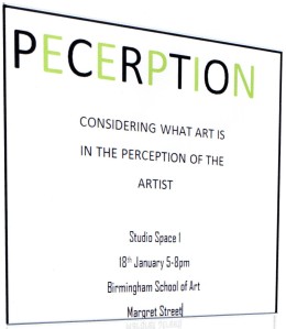
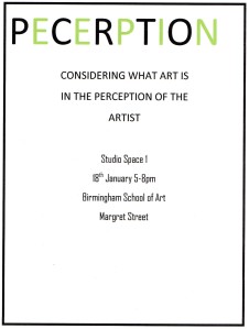
I have been looking at everybody else’s version of what we ultimately want the poster to look at. So using the resources I have at the moment i.e ‘no Photoshop’ I ended up using Microsoft. I stuck to the theme that we all decided on ‘Perception’ and just add a little bit of text at the bottom because i thought that relating on my previous post about ‘Typography’ posters because i thought that they would suit it better. Although there isn’t much going on visually on the poster as a reading enthusiast it would intrigue me more because i would want to find out more about the show and hopefully this applies to other viewers.
