
Poster Ideas
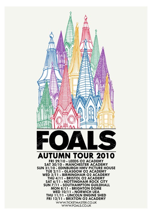
The poster above for music band Foals really attracted my attention for its hand drawn qualities, use of colour but mostly its clever composition. The focus and title of the poster ‘FOALS’ is centred between image and the text that mirror each other in their layout creating a overall shape to the poster as well as highlighting the centre text. Although there is use of colour, it still feels fairly quiet, simple yet memorable. I could imagine that if it was a poster/leaflet for a exhibition it would be a contemporary Fine Art show in a white cube space, it has that modern feel to it.


Taking inspiration from the Foals poster, I have created 2 poster designs for the show. I have tried to create a simple, clean composition that has a shape to it similarly to the influence. The focus of the first poster above is ‘PS1’ which to some people doesn’t mean anything, however to the students in the university (our audience) the space is very recognisable and easy to locate as most, if not all, are familiar with it. All of the other information is placed around the text ‘PS1’, highlighting its significance. Underneath the big bulk of text is the time of the show and the artlife blog URL placed separately therefore saying it is also important information. After research, I discovered that I liked a poster/leaflet that didn’t give you too much in depth information about the show as I feel that the viewer should do a little bit of background research their self prior to viewing a show, or just visit a show with a open mind and read the press release afterwards to confirm or disagree with there judgement of the show. Viewers will have both options with our show- the blog is the source of prior research and the press release will be available at the show.
The second poster echoes the Foals poster slightly more so, as the layout of the text decreases in size creating a cone shape, underneath the imagery which is the groups logo. The group has became the greater focus in the second poster as the logo is the largest and boldest aspect of the poster followed by the title of the show ‘Perception’. The information underneath it is read after, leading down to the blog URL in the smallest font which is again put there for the viewer to gain greater knowledge of artlife and the show. As a group, there is a common interest that the blog, posters/leaflets, press release and show itself all work together as a whole. I feel that both of the above posters are successful in their simpleness echoing the blog and more importantly, the space which is a contemporary white cube space.

One comment